

“…The Rise of the Matildas…” – Sam Kerr, 17/9/2020
In a room full of Matildas and Socceroos on a Zoom call, plus Nina Las Vegas & Adam Peacock as hosts, the new Australian national kit has been released.
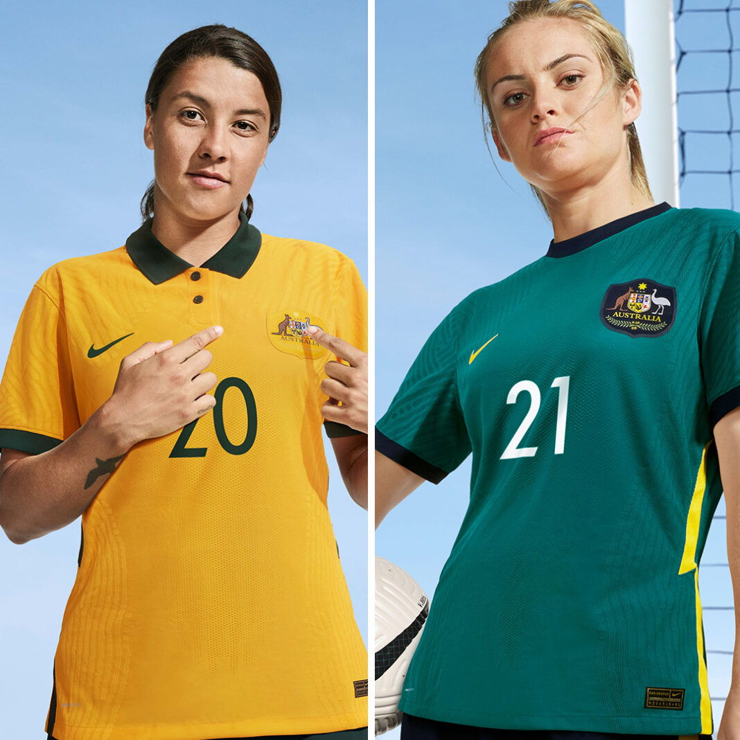
These two kits call back to classic designs of the past. The home kit has clearly been visiting the home kit of 2015-16, and notable changes include a modified collar featuring a two button polo neck style with rounded edges.

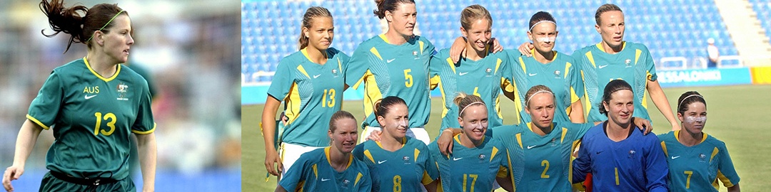
The away kit has returned back to the national team kits of 2004 and the 2000 Olympics with a teal base and rounded collar. In this design the collar is matched to the dark green of the home kit and sits in a subtle contrast to the cool tones provided by the teal.
For both new designs, we have faint contour lines over the shoulders and down each side, repeating the current Nike template. These patterns wrap around both sides and presumably over the back. Along the seam line on both sides we also have a contrast panel with a sharp zig-zag that matches the dark green shorts.
Speaking of shorts, there may be singing in the halls as both the home and away kits move to green shorts and gold socks, something that a fair amount of fans online have declared will break a curse of losses.
After the last Matildas kit, which was iconic and a big change to the standard, it’s easy to see the intention here is to have a clean and solid kit again. It also elevates the special nature of a kit and means it will stand for quite some time into the future. We all loved the 2019 World Cup kit, but the change back to a classic kit, especially the home kit, is stylish and the attention to detail is always welcome.
The teal may be a little divisive but our away kits have never been the strongest element of our designs. Having said that it’s good for the away kit to have something that may elevate it to its own identity.
To summarise, the design is a fresh take on a couple of classics and one I’m happy to see done well, especially as we’re heading into some big competitions. Wherever we may end up watching the games, these will sit proudly on the field, in the stands and in front of TVs at home.
Our Editor also interviewed Caitlin Foord on it: ” I just feel privileged”
Related Images:


